From ‘Goblin’ to ‘CHROMAKOPIA’ – We Have All of Tyler, the Creator’s Album Covers Ranked
Tyler, the Creator is one of the rap game’s most creative voices. His ‘CHROMAKOPIA’ rollout was grand, to say the least. We’ve ranked all of his album covers.
By Xavier GauthierJune 7 2025, Published 4:29 a.m. ET
The Breakdown: Tyler, the Creator has become one of the most iconic names from the blog era. He stands among the likes of Kendrick and Drake after the release of CHROMAKOPIA, his eighth studio album. We’ve ranked his album covers in light of his boundless creativity.
Tyler, the Creator has had an extensive music career and has cemented himself as one of the blog era’s finest. He’s renowned as one of the most creative minds in the music scene. Beyond the music, he’s known for his storytelling visuals, which have expanded his range into fashion. In light of those visuals, we’ve ranked his album covers and broken down which project has the best artwork.
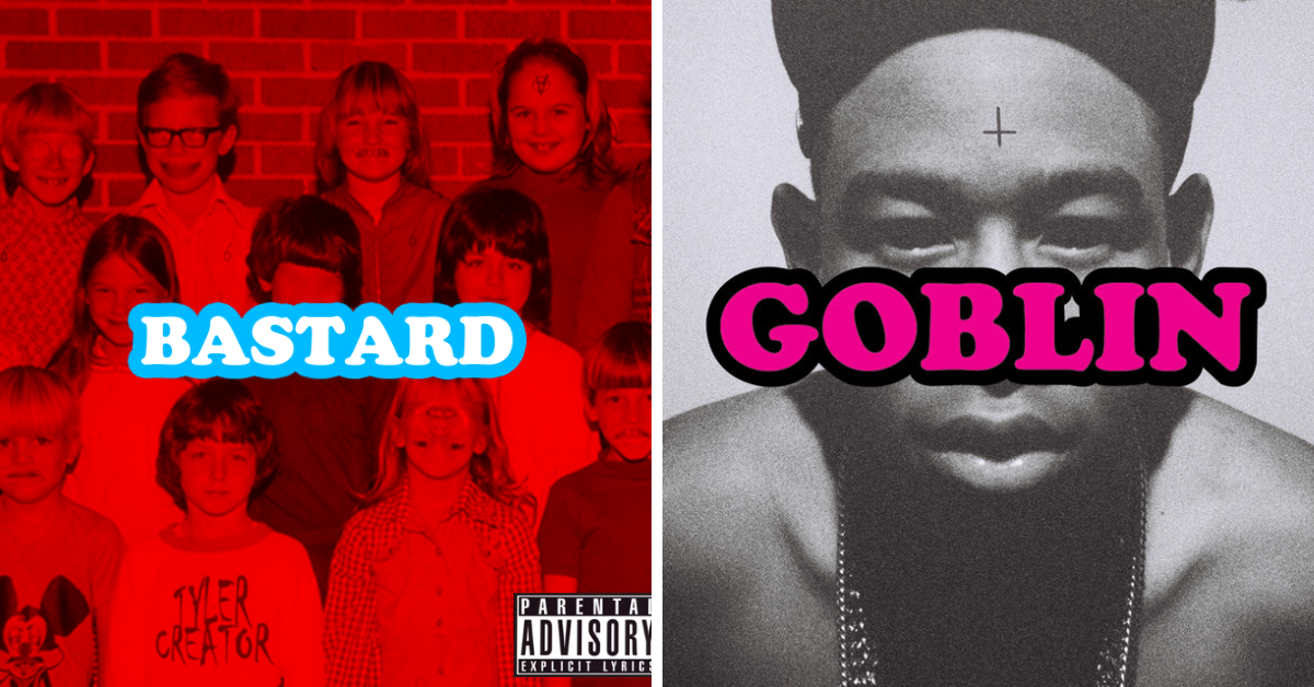
Album artwork for 'Bastard' and 'Goblin'
8. ‘Bastard’ (2009)
Bastard officially introduced Tyler, and consequently Odd Future, to the blog era. They were still considered underground and found a niché subcommunity of hip-hop fans. Bastard is now one of the most well-known album covers of the era, partly due to the bright red background accented by bright white and sky blue Cooper Black font title. It’s also known for its grotesque themes and for introducing fans to Tyler’s personas.
7. ‘Goblin’ (2011)
Goblin expands on the gruesome world of personas fighting for control over Tyler’s mind. This cover is like a remix of Bastard’s as Tyler’s monochromatic face replaces the strange ensemble of red children, and the album’s Cooper Black font title has an opposing pink and black color scheme.
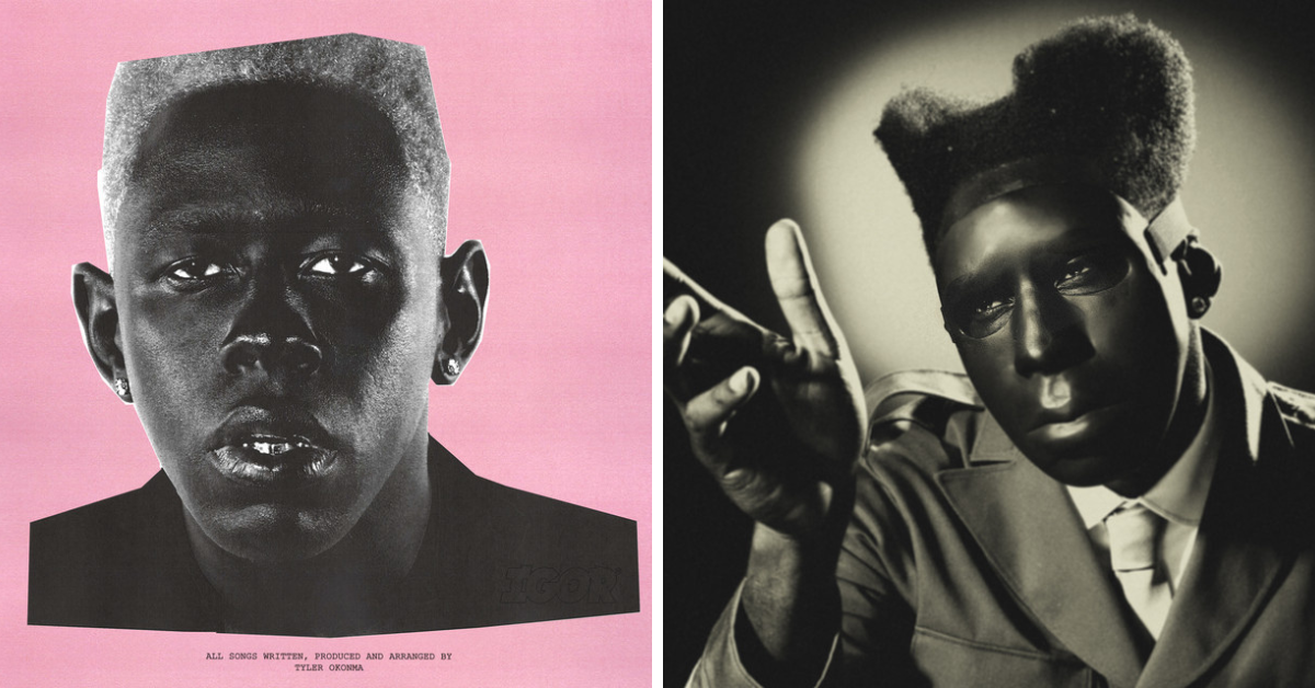
Album artwork for 'IGOR' and 'CHROMAKOPIA'
6. ‘IGOR’ (2019)
While IGOR is hailed as one of Tyler’s best albums to date, the album cover simply lacks much to offer. It features a pink paper background with a cutout of the Igor character placed on top. At the bottom of the cover, there’s simply typewriter font text that says, “ALL SONGS WRITTEN, PRODUCED, AND ARRANGED BY TYLER OKONMA”. The other visuals for IGOR were amazing, though, and the album's themes around love keep listeners captivated by the story.
5. ‘CHROMAKOPIA’ (2024)
2024 marked what was probably Tyler’s biggest year in music so far. His highly anticipated CHROMAKOPIA is his eighth studio album, and he went big with his rollout. The cover features the album’s respective persona, Saint Chroma, reaching out to something or someone. The cover is fully monochromatic in color, and while it doesn’t offer much else than the character, it does still embody the energy of the album. There’s a sense of longing – longing for love, self, and understanding.
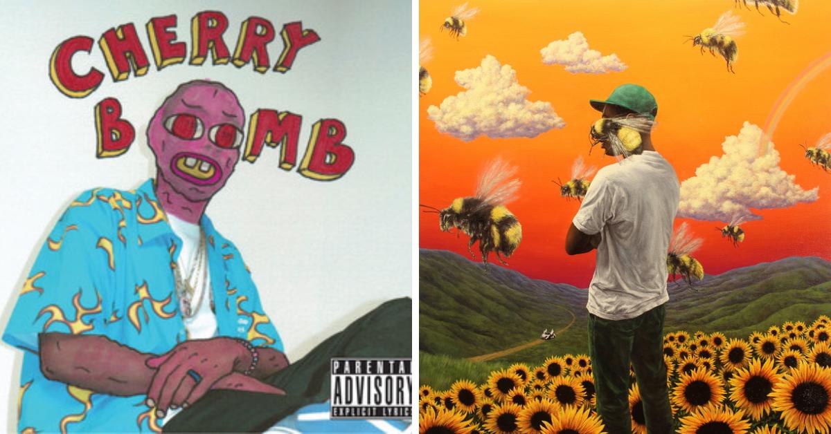
Album artwork for 'Cherry Bomb' and 'Flower Boy'
4. ‘Cherry Bomb’ (2015)
Cherry Bomb was the first album that didn’t feature any personas after the Wolf timeline of the first three albums. While the mascot of the album, Chur Bum, can be seen on the album cover, he is not a character with any distinguishing voices, ideologies, or desires. He serves merely as a mascot for the break from exploring life through personas. It’s a simple album cover, but the 80s-themed shirt and drawn-on face and arm skin give the cover a very nostalgic feeling.
3. ‘Flower Boy’ (2017)
2017 was the year that broke Tyler out of the underground scene officially. With the release of “See You Again,” “911/Mr. Lonely,” and “Who Dat Boy,” he caught mainstream attention and has proven that he can keep it engaged. The mix of orange hues in the sunset-esque sky over a mountainous landscape with sunflowers exemplifies the album’s sound and themes perfectly. The bees became part of that era’s iconic look for Tyler and his
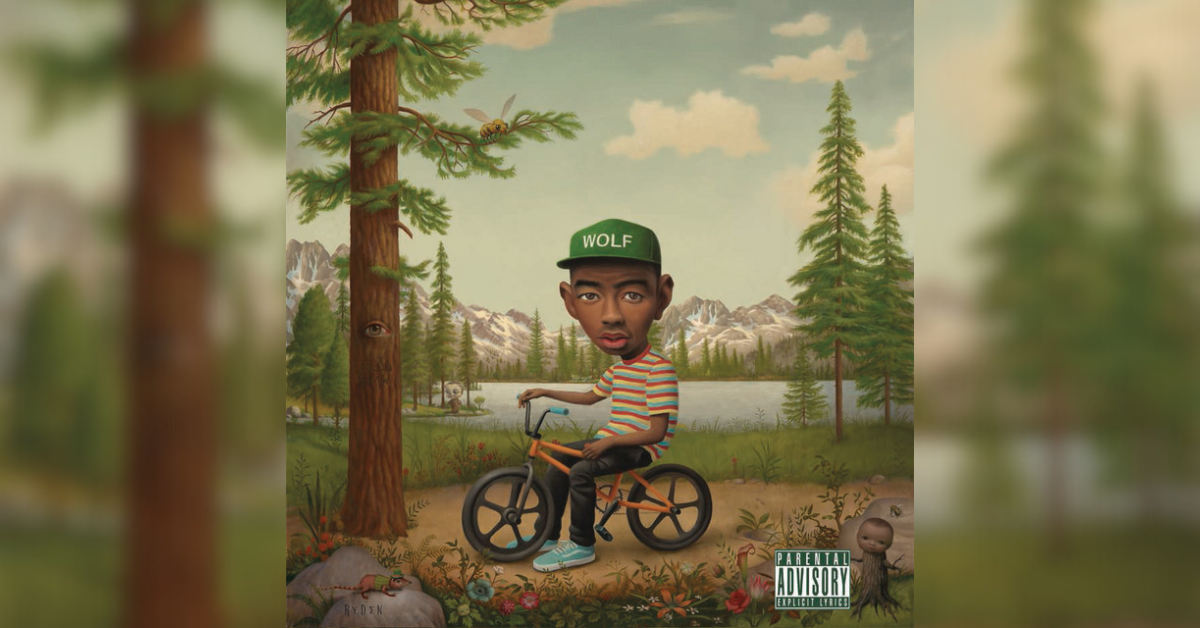
Album artwork for 'Wolf'
2. 'Wolf' (2013)
Backtracking a bit to the piece about Tyler’s personas coming out, Wolf tells a story with that premise in full effect. As the album that rounded out the original trilogy of albums following Tyler/Wolf and Dr. TC, its theme of a sleepaway summer camp for troubled kids is brilliant. While Bastard and Goblin focus on Tyler’s struggle with his emotions taking over and becoming too violent, Wolf shows us the side of him that was fighting to heal from wounds and the damage that these personas caused.
The cover art for Wolf is like something out of an uncanny valley-esque stop-motion film. Wolf is taking a break riding Slater (his bike) to stop and smell the roses, but some things are just…off. The tree has an eye like the forest is watching, there’s a character in the background with an enlarged head, a small tree stump with a baby’s head, and a mouse with a leprechaun outfit on. The artwork is strange, to say the least, but it encapsulates all that Camp Flog Gnaw is presented to be.
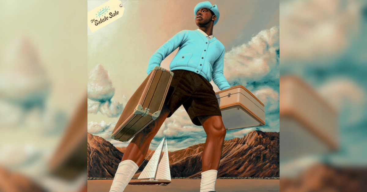
Album artwork for 'CALL ME IF YOU GET LOST: THE ESTATE SALE'
1. 'CALL ME IF YOU GET LOST: THE ESTATE SALE' (2023)
The reissue of his 2021 album CALL ME IF YOU GET LOST presented fans with all-new artwork along with brand-new tracks. While the original artwork would’ve probably been ranked closer to number six or five, THE ESTATE SALE’s artwork gave it a significant boost. Reminiscent of the Flower Boy artwork, we see the album’s persona, Mr. Baudelaire, looking off into the distance with his luggage cases.
Mr. Baudelaire personifies Tyler’s sauvé, globe-trotting, jet-setting side. The art style does a lot to make the cover art feel more like a family portrait in a mansion than something that’s selling off shelves. The image of Tyler “Baudelaire” wearing luxury clothes that he designed himself, the boat sailing off in the background, the rocky mountains, and approaching clouds on the horizon shows that a new adventure is incoming, but it may be one ventured alone and with challenges.